The Fruit Fixation
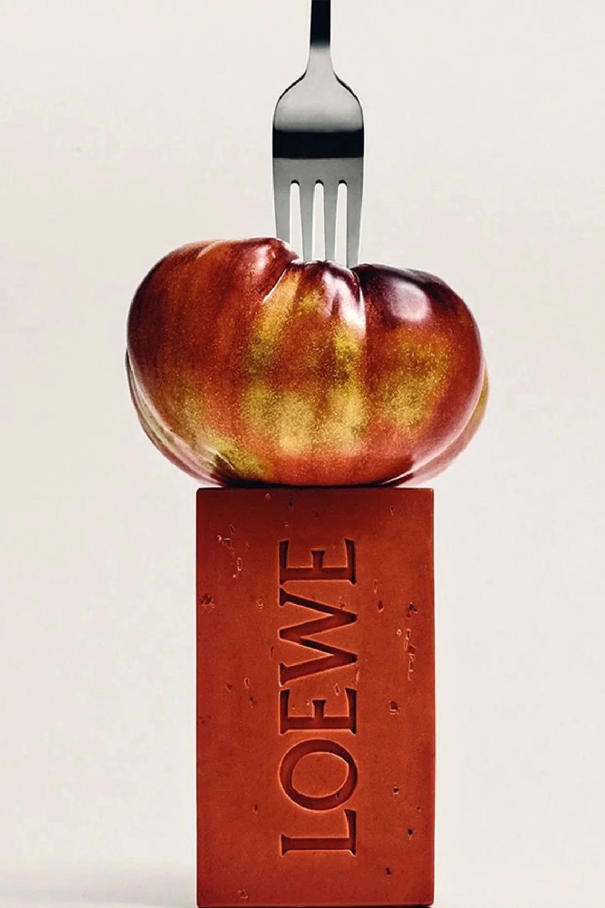
There is something slightly paradoxical about the fact that some of the most expensive brands in the world are currently centring their visual identity around fruit. Tomatoes, bananas, cherries - objects that are universally accessible, low-cost and deeply ordinary, are increasingly appearing across luxury campaigns, product design and visual merchandising.
This shift is not accidental. Historically, periods of economic uncertainty tend to produce a return to simplicity in visual culture. In classical still-life painting, fruit was used to communicate value, temporality and material reality. Similarly, in contemporary fashion, we are seeing a recalibration of luxury language away from excess and towards immediacy.
The timing aligns with broader market signals. In 2024-2025, global luxury growth slowed significantly, with reports indicating a deceleration to low single-digit growth after years of expansion. At the same time, consumer behaviour has shifted: younger audiences are increasingly driven by relatability, humour and visual clarity, rather than traditional status signalling. In an environment saturated with content, brands are under pressure to communicate faster and more intuitively.
Fruit functions as an effective visual shortcut. It is instantly recognisable, emotionally neutral but positive, and highly shareable. It reduces the cognitive effort required to engage with an image, while still allowing for strong aesthetic execution. In digital terms, it performs well: bold colour, simple form, and high contrast make it ideal for social platforms where attention is limited to a matter of seconds.
Several luxury brands have leaned into this approach with distinct interpretations. Jacquemus has embraced fruit as part of a broader strategy of playful surrealism, using oversized props and Mediterranean references to create campaigns that feel both aspirational and accessible. Loewe has taken a more conceptual direction, transforming fruit into sculptural objects and accessories, reinforcing its positioning at the intersection of craft and art. Brands such as Rhodes or Skims, while less literal, reflects the same underlying shift, prioritising tactility, materiality and emotional resonance over overt spectacle.
What emerges is not a trend in isolation, but a broader change in communication. Luxury is moving away from abstraction and distance, and towards clarity, tactility and immediacy. In this context, fruit becomes less about symbolism and more about efficiency; a way to create connection without over-explaining.
Ultimately, the use of fruit in contemporary fashion campaigns signals a subtle but important repositioning. As audiences become more selective and less responsive to traditional markers of prestige, brands are increasingly relying on visual languages that are direct, human and easy to process. The message is no longer about convincing the audience of value, but about creating an immediate, almost instinctive response.
And right now, few things achieve that as effectively as something as simple as a tomato or a cherry.